5 min read
Why buttons don't all feel the same
We press hundreds of them a day and never think about it, right up until one feels good. The workbench is where I keep the ones that do.
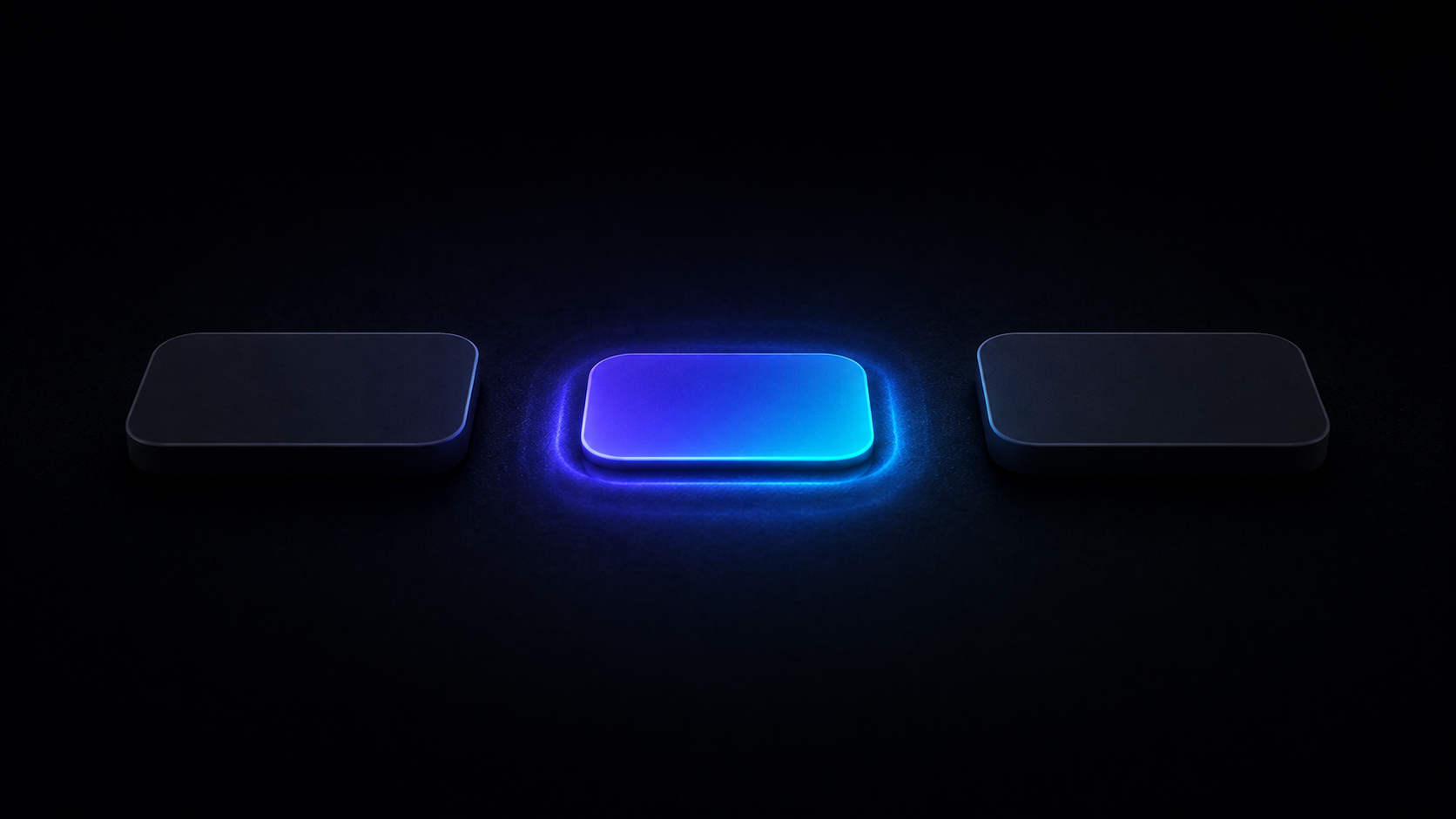
You press buttons all day. On your phone, on a tablet, on a laptop, probably a few hundred times before lunch. And they do not all feel the same.
Some of them feel good. There is a small satisfaction to pressing them, a sense that the thing acknowledged you. Others feel like nothing at all, and you find yourself half-wondering whether it registered. Most people could not tell you what the difference is. They just know one of them felt better.
The difference is feedback, and it is almost always tiny.
The part nobody notices#
A button has more states than people expect. Default, hover, active, focus, disabled, and loading if it does anything slow. Six, and most implementations ship two.
Hover is the one everyone remembers, because everyone builds on a laptop with a mouse in their hand. But hover does not exist on a phone. There is no cursor to hover with. So on the device most of your visitors are actually using, all of that careful hover work does precisely nothing, and the only feedback available is what happens on press.
Mine dips. The button scales to 96% over 80 milliseconds while your thumb is down, then springs back. That is the whole thing, one line of CSS. It is small enough that nobody consciously notices it and large enough that its absence feels wrong.
Go too far and it breaks. Below about 90% it reads as the button malfunctioning rather than responding. Much longer than 80 milliseconds and a fast double tap queues up two animations. And it has to be a transform, never width or padding, because a transform is composited and does not make the browser redo the layout of the page underneath.
That is a lot of thought for something nobody will ever mention. It is also the difference between a site that feels finished and one that does not.
So I started keeping them#
The workbench is where those live now. It is a collection of components I like, for one reason or another, with the knobs left on so you can turn them.
Not a framework, and not an attempt at completeness. Some are there because they took a while to get right. Some are there because they are the sort of thing I will want again and would otherwise rebuild from memory, badly. Some were built for one specific client and will probably never be used again, but I want to remember how they worked.
The press dip has a slider for the scale and one for the duration, so you can dial it to 0.8 and feel exactly how wrong that is. Which is a better argument than any paragraph I could write about it.
Two pages, two jobs#
I wrote recently about why every site I build now gets a brand page, and this is a fair question: why does a site need two reference pages.
Different jobs. The brand page is about this site. Its colours, its type, its spacing, the specific way things look here. If I add a page, it tells me what that page should look like.
The workbench is about the parts, wherever they came from. Nothing on it is specific to this site, and several of them came out of client projects. It is the page I open when I am starting something new and I want to remember what actually goes into a button, or a field, or a set of tabs. Not the colours, the anatomy.
The one I am proudest of#
The globe.

Split Lip Adventures is the site of an adventurer who has been all over the world, and the brief included his photography. The obvious answer was a gallery. Grid of images, click one, lightbox. It would have been fine and it would have been the same as everything else.
Instead the photos sit on a globe you can grab and spin, with a marker on each location. It rotates on its own until you take hold of it, and picks up again five seconds after you let go. Every marker is a real HTML button positioned on top of a canvas, which is the part that took the longest to get right.
The bit I did not expect was the effect it had on him. He came back saying he now wants to make sure all his photos are uploaded, and that he wants to travel more so there are more pins on it. A component changed what the client wanted to do next. That has not happened to me before.
It is on the workbench with its configuration exposed, so you can change the colours, the tilt and the spin speed and watch it repaint.
Why not Storybook#
The reasonable question. Storybook exists, it is very good, and it does most of this.
I do want to use it properly at some point. I think it belongs in my professional life rather than on small client sites, where the setup and the second build step cost more than they return. And for this particular collection it would not fit anyway, because these are mostly CSS classes rather than React components with a props API. The stories would only restate the class strings you can already read in the code panel.
So: about two hundred lines, inside the same static export, no extra build. If it ever grows real prop-driven components worth testing in isolation, I will revisit that.
The point#
None of this is a framework and I am not proposing you adopt anything. It is a shelf of parts I liked enough to keep, in a place where I can pick them up and turn them over.
And if you take one thing from it, make it the press. One line, eighty milliseconds, and your site will feel better on a phone than most of the ones you use every day.
Enjoyed this one?
Hit the heart so I know to write more like it.
Keep reading
£1,330 a year off three clients' bills
I kept telling people I save clients money without ever putting a number on it. So I built a running total that works itself out daily, and made it show where every line came from.
WAKOOS Centre4Children is live
WAKOOS Centre4Children is up: a charity nursery in Billingshurst, off an ageing drag-and-drop site builder and onto Next.js on Cloudflare. £781 a year of hosting became about £20, and the £20 is just the domain names.
Someone emailed me about a page I didn't have
I set up me@danielhadaway.dev with this site and it sat empty. The first email to land in it was a stranger in Texas asking if I'd build a page I'd never heard of. I built it that evening.