5 min read
Why every site I build now gets a brand page
It started as a component library for one. It turned into the page I point AI tools at when I want them to understand my site without explaining it again.
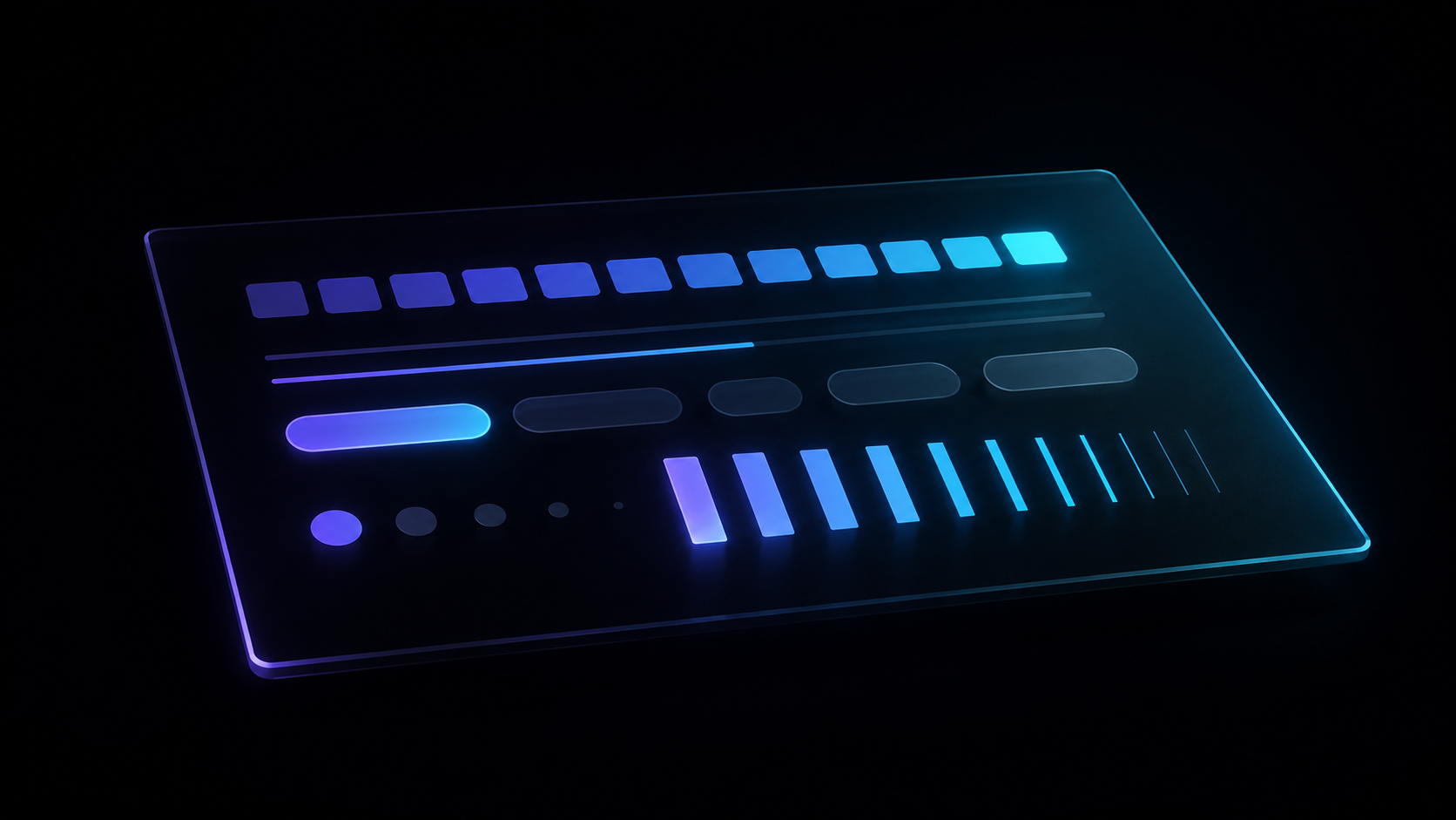
It started on Darras Index, and slightly by accident. I had seen Storybook and the other component-library tools, decided they were more machinery than a one-person project needed, and thought I could probably build a simpler version myself. Spoiler: I build with Claude these days and it is very good at exactly this sort of thing, so “I could knock that up myself” turned out to be true for once.
What came out was a single page called /brand. Every colour, every component, every state, rendered live rather than described.
Every state, in one place#
The immediate benefit was visualising the things that have variants. Buttons are the obvious one. A button is not one thing, it is six: default, hover, active, focus, disabled and loading. Typography is the same story, a scale of sizes and weights that only make sense next to each other.
While you are building, you see maybe two of those states. You are using a mouse, so you never see the focus ring. Nothing is loading, so you never see the spinner. The disabled state exists in your head and nowhere else. Putting all of them on one page, forced on at once, is the difference between believing they work and knowing.
The second benefit showed up later. When I add a new page, I do not start from nothing. I open /brand, pick from what already exists, and assemble. New pages end up looking like they belong instead of nearly matching.
The benefit I did not see coming#
This is the part I would not have predicted, and it is now the reason I would tell anyone else to build one.
A brand page is a single URL that contains your entire theme. Which makes it an extremely good brief for an AI tool.
If I want to mock up a new page in Lovable, or I am talking to ChatGPT about a layout, I do not describe my palette, my type scale, my button styles and my spacing rhythm from memory. I point it at /brand. One link, and it has the lot.
Before that, every conversation started with me re-explaining my own site, badly, from memory, slightly differently each time. Now it is the difference between explaining your site and linking to it.
I built the page for me. It turns out it is at least as useful to the machines.
Rebranding without the fear#
Darras Index went through a complete colour change: near-black and hot pink out, off-white, navy and teal in. I wrote about why that mattered at the time.
On paper that is a terrifying change to ship. In practice the brand page made it straightforward, because I could see every component repainted at once. Does the muted grey still hit 4.5:1 on a light background. Does the focus ring still show up now the ground is pale. Did anything quietly depend on the old dark theme without saying so.
All of that is visible on one screen, in about a minute. The rebrand took an afternoon.
A design system does not need a team#
The obvious objection is that design systems are a team thing, and I am one person who wrote every line of this site myself.
I do not think that holds. Half of it is memory: I genuinely do not recall what I decided six months ago, and the page remembers for me. The other half is simpler than that. After a day of looking at code, it is quite nice to look at the actual components instead. Rendered, in every state, in one place.
Why it is not in my navigation#
The page is unlisted and noindexed. It feels odd to want a brand book of all things ranking in search results. I am happy to link to it and reference it, which is what this post is doing, but I would not put it in the nav or shout about it. The note at the top of the page says it better than I can: if you are reading it, you went looking.
Two things in there are not standard brand-book material, and both earn their place.
The share cards are how the brand actually looks to most people. Nobody’s first impression of this site is the homepage, it is a link preview in WhatsApp or Slack. That preview is the brand, so it belongs in the document about the brand.
The easter eggs are in there because they are part of what this site is. There are nine of them, and they exist because the site is not only a showcase of work. It is also meant to say something about who I am as a person and an engineer, and the eggs carry more of that than the case studies do.
Every build gets one now#
It has become a standard part of how I start a site, and it has turned out to be useful on client work for a reason I did not anticipate either. Clients frequently have no starting point. They know they want a website and that is about as far as it goes. Putting colours and components in front of them early gives them something to react to, and people find reacting far easier than answering.
Which is roughly the same reason it works for me. It is easier to look at the thing than to remember it.
Enjoyed this one?
Hit the heart so I know to write more like it.
Keep reading

Six years late, my New Zealand drone footage finally made it into a film
In February 2020 I flew a drone around New Zealand and came home with hours of footage. I never edited it. This week I gave the lot to Claude and HyperFrames and ended up with a full film, a trailer and a stack of vertical clips.
£1,330 a year off three clients' bills
I kept telling people I save clients money without ever putting a number on it. So I built a running total that works itself out daily, and made it show where every line came from.

Setting up email for a small business
Every client site I've built has needed email, and nearly all of them needed the same small thing. Then one client wanted to send email out from his own address. Three levels of setup, what each really costs, and why the free options quietly rule out the third.