3 min read
A fresh coat of paint for Darras Index
Darras Index has swapped its dark, pink-accented look for something lighter and calmer. Here is the thinking behind it, and why such a dramatic change turned out to be easy to ship.
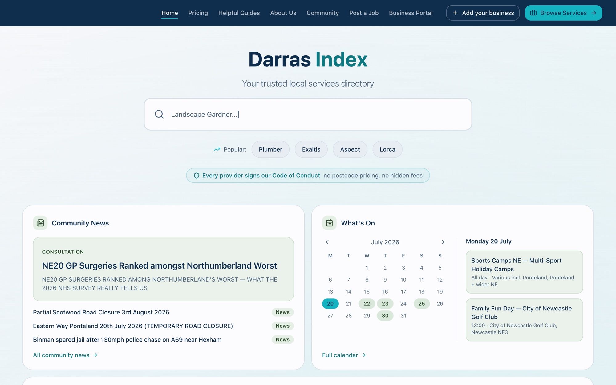
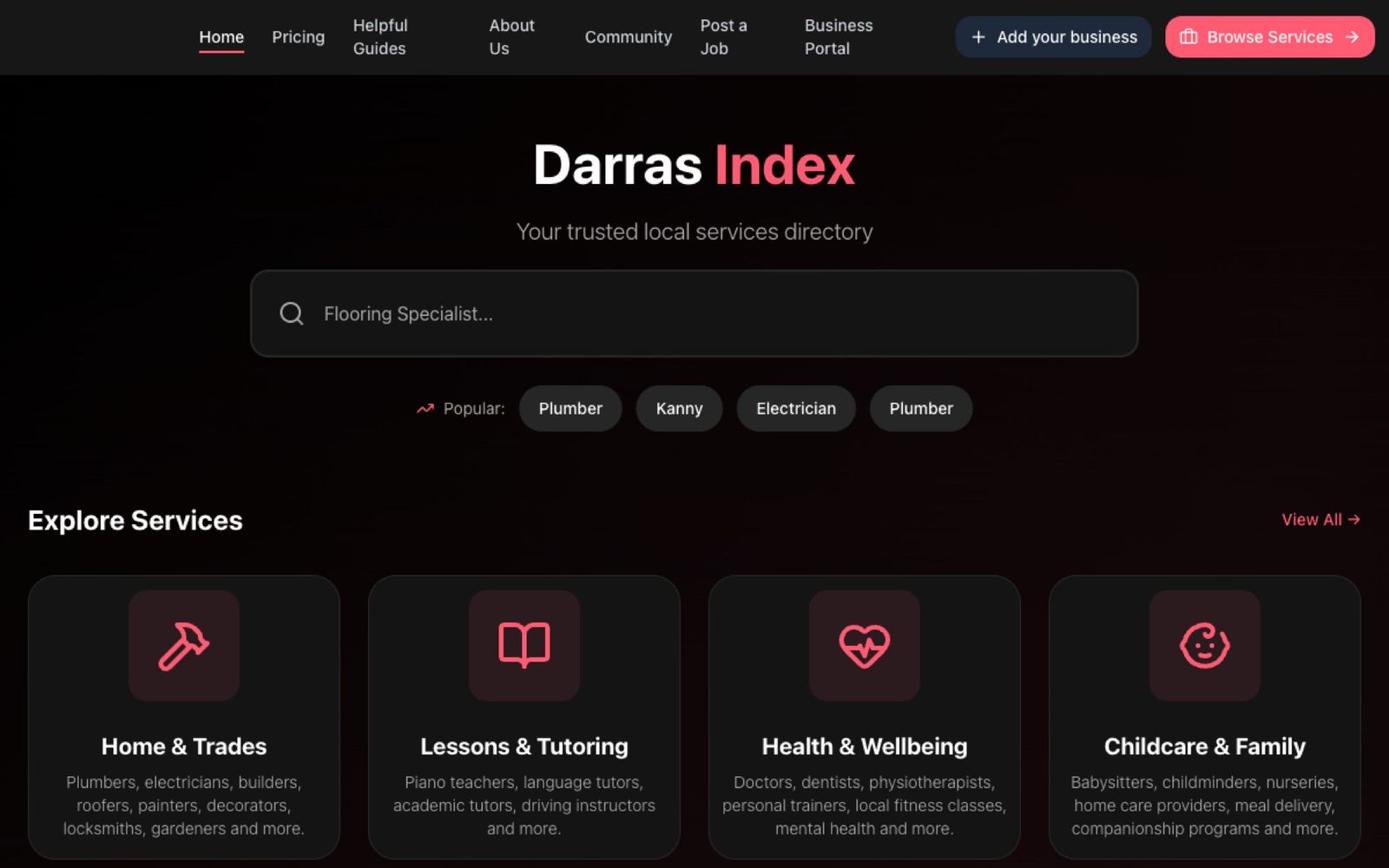
Darras Index has had a colour refresh, and it is a big one. The old site leaned dark, with a near-black background and a hot-pink accent. The new look is lighter and calmer: an off-white background, a deep navy for structure, and a teal doing the work the pink used to. Drag the handle below to compare.
 BeforeAfter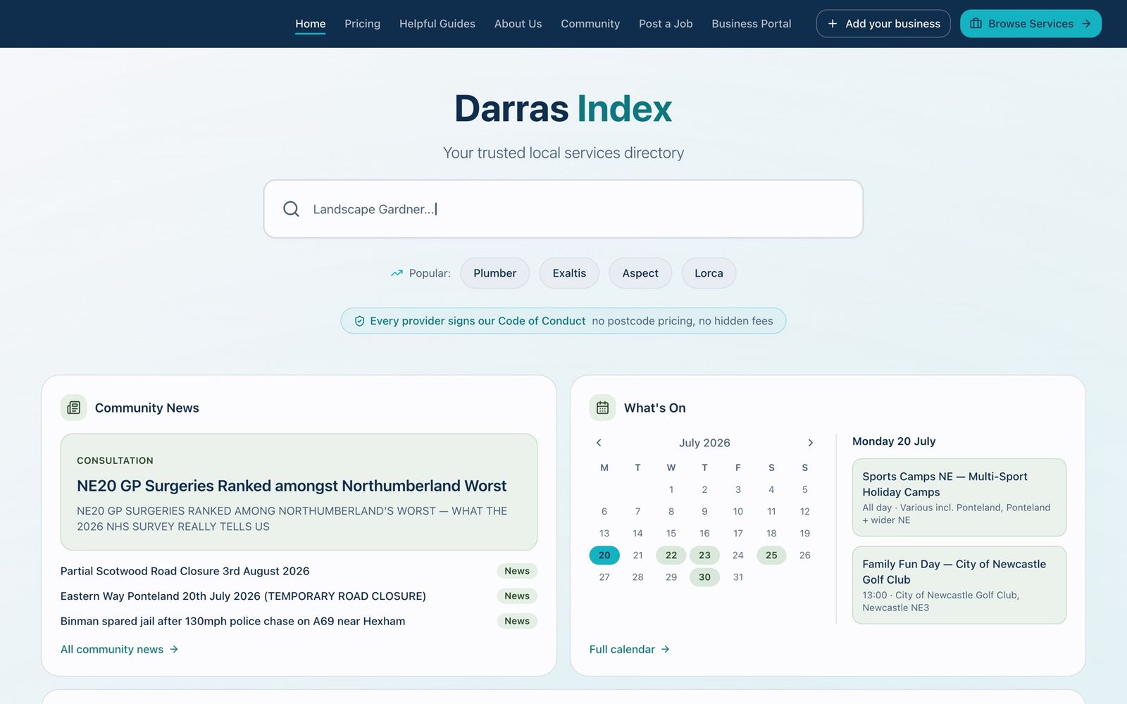
Why the colour actually matters#
This was not a change of taste. It came out of a branding advisory session, and the part that stuck with me was simple: colour communicates before anyone reads a word. Darras Index asks two things of people. It asks residents to trust a local directory, and it asks businesses to pay to be listed on it. Both need confidence, and a dark theme with a hot-pink accent was not saying “trusted local service”.
The new palette is built around that idea. Navy carries the trust and the authority. Teal carries the actions: buttons, links, calls to action. Sage warms up the community sections. Coral shows up only rarely, for the odd “new” label or alert. And the background is off-white rather than pure white, which keeps the whole thing feeling soft rather than clinical.
A more community-first home#
The refresh was also a chance to rethink what the home page is for. Darras Index is not just a directory. It is closer to a digital village notice board, so the new home page leads with that: local community news and a What’s On calendar sit front and centre, with the services directory alongside them rather than dominating. The colour and the layout now tell the same story, that this is a place for the area and not just a list of tradespeople.
Why a dramatic change was easy#
On paper, going from a dark pink theme to a light navy-and-teal one sounds like a big rebuild. In practice it was not, because the site was set up for exactly this. Every colour lives once, as HSL design tokens in a single globals.css file, and all the Tailwind classes read from those tokens (bg-primary, text-navy, bg-sage and so on) instead of hard-coded hex values. A matching brandColors.ts file mirrors the palette for the few JavaScript contexts that CSS cannot reach, like the Clerk sign-in styling and generated graphics.
So a dramatic visual change was mostly a case of editing the token values in one place and letting the whole site follow. There is also a /brand page that renders the live palette, buttons and components in one view, which made it easy to check the new colours held up everywhere before shipping. It is boring plumbing, but it is the reason a full rebrand took an afternoon rather than a fortnight.
Same site, new feel. And a good reminder that the groundwork you lay early, design tokens and a brand page, is what lets you make a bold change later without fear.
Enjoyed this one?
Hit the heart so I know to write more like it.
Keep reading

Six years late, my New Zealand drone footage finally made it into a film
In February 2020 I flew a drone around New Zealand and came home with hours of footage. I never edited it. This week I gave the lot to Claude and HyperFrames and ended up with a full film, a trailer and a stack of vertical clips.

Three days, two lakes and one leaky dry suit
I've wanted to learn to dive since I was a teenager. Three days, one pool, two lakes and an online exam later, I'm a BSAC Ocean Diver. I also lost a mask, discovered a dry suit is not always dry, and noticed my weight belt was loose at 18 metres.

Why I've started writing (and joined the /now movement)
I've started writing things down: achievements, struggles and the odd professional opinion. Along the way I found the /now page movement and got myself listed on nownownow.com. Here's the why.